A curiosity-inducing subject line and a captivating copy can only get your subscribers to engage with email, but it might not be enough to redirect them to your website. This is where CTA buttons come into action. These buttons offer a seamless method for the customer to visit your website, or any landing page, with a single click of a button. Now, there are a couple of ways to incorporate CTA buttons in your email. You can convert PSD to HTML email template or directly embed the button in the HTML coding. But, putting a CTA button in your emails and designing click-worthy buttons are two very different things. Here are the best practices to help you design effective CTA buttons for your templates.
Best practices for designing effective CTA buttons for your emails.
-
Use action verbs
While crafting CTA buttons, you should always use action verbs. Tried and tested phrases like “shop now”, ” learn more”, and “click here” can be used without worrying about their effectiveness. But, these phrases will not make your email stand out as virtually every other brand uses them. Trying something different will help capture the reader’s attention and make them click on it.
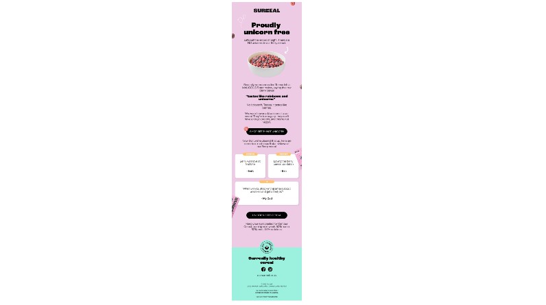
Surreal has created a truly wonderful email with a unique CTA phrase. In their email copy, Surreal explains how one of its customers described that the cereal tastes like rainbows and unicorns. The email goes on to explain the drawbacks of adding the one-horned imaginary creature to their ingredients list. Finally, the CTA button reaffirms their claims by stating the main ingredient is berries and not unicorns. There is another CTA button towards the end of the email which states the same.
-
Fabricate FOMO
For time-bound offers, the CTA button should create a sense of urgency. People will be more likely to click on the button thinking they may not get such a deal in the future. Therefore, you can capitalize on this irrational fear to bring more traffic to your website. Such CTA buttons are more prevalent in email templates for eCommerce brands. However, do not overuse these tactics as it might decrease the overall impact of your future promotional emails.
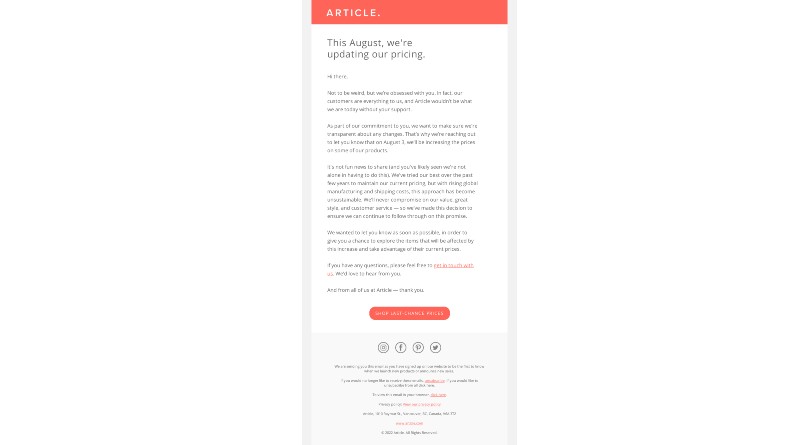
Article sends an update email about their product pricing. The copy states that due to uncontrollable circumstances, they had to raise their prices. Therefore, they are offering their customers one last chance to scoop some of their items at the previous prices. The CTA supports the narrative by offering these last-chance prices.
-
Use contrasting colors
During the designing process, make sure that the color of the CTA button contrasts well with the template’s background color. The color should highlight the CTA button without clashing or merging with the background. You can also use the whitespace around the button to separate it from the main copy. If you are unsure about which color to use, run an A/B test to see how the readers responded to different colors. According to a recent survey, red, orange, green, and yellow are some of the best colors for CTA buttons.
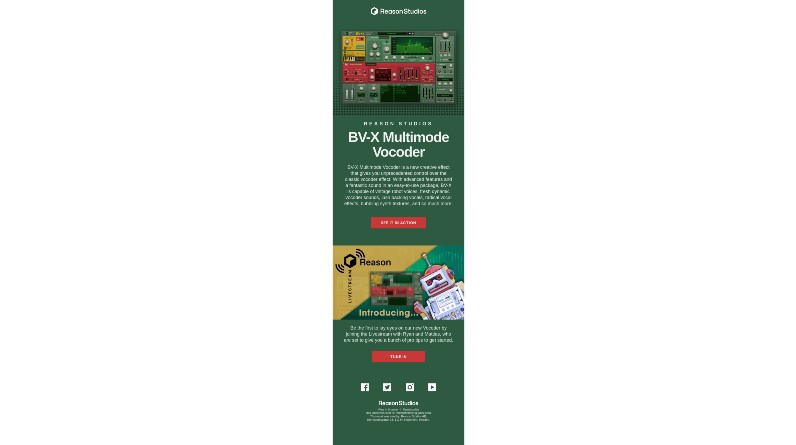
Reason Studio has a vibrant email template design. The background color is green, and the product image is also green with splashes of red and yellow. But, the best part of its template is its bright red CTA button. The color contrasts well and pops out from the rest of the design. The CTA phrase is also fairly straightforward.
-
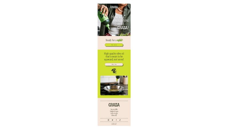
Choose the dimensions wisely
Now, your aim should be to make your CTA button visible, without it being too distracting. For example, using a smaller CTA button will make it harder for the reader to find it and will not capture their attention. On the other hand, a bigger CTA button will be more imposing and might turn away subscribers as no one likes being told what to do. Furthermore, it is better to widen the CTA button when you are using longer phrases. Elongated CTA buttons can be visibly off-putting for some readers.
Even though Graza uses short CTA phrases, the button is widened to align with the above paragraphs. As a result, the placement of these buttons looks aesthetically pleasing. In addition to that, both the CTA buttons are painted in contrasting colors. The buttons also have a chequered outline to give them a 3D effect.
-
A/B test your CTA buttons
As the title suggests, run multiple A/B tests for CTA buttons to find what works for your customers. For example, even though red is one of the best colors to use for the CTA button, it might not be the right choice for your readers. Similarly, your readers might enjoy the usual CTA phrases instead of witty ones. A/B tests will help you find answers to such questions. Moreover, for users who prefer to convert PSD to an HTML email template to insert CTA buttons, A/B tests will help you ensure that these buttons are working properly in all email browsers.
Conclusion
An attractive CTA button will instantly capture the reader’s attention and encourage them to interact with your content. This, in turn, increases traffic to intended web pages. Use the best practices mentioned above to create the perfect CTA button for your email campaigns.