Bubble charts are a great way to visualize data, and they can help you to see relationships between data points that you might not otherwise be able to see. Bubble charts are also a good way to compare data points, and they can help you to see patterns in data. Keep reading to learn more about bubble charts and how you can make them in order to analyze data.
What are bubble charts?
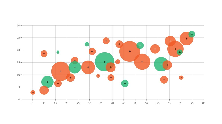
A bubble chart is a graphical representation of data in which each data point is represented by a circle. The size of the circle is proportional to the value of the data point. The position of the circle on the x-axis and y-axis indicates the value of the data point on that axis. A bubble chart can be used to compare values for different data points or to compare values for different groups of data points.
Bubble charts are a great data visualization tool to illustrate things like financial information because they allow you to see how the size and position of the bubble are related to the value of the data point. They can also be used to compare the performance of different companies.
What are some tips for creating bubble charts?
When it comes to data visualization, you can make a bubble chart to show comparisons between different data points. You can use these charts to show how a particular data point relates to the rest of the data set or to compare multiple data sets. You’ll want to start by choosing the right data set. Bubble charts are best used for data sets that have a large number of data points. If you have a data set with only a few data points, it may be better to use a different type of chart. Next, you should label your axes. It’s important to label your axes so that your viewers know what’s being represented.
When creating your chart, you’ll also need to determine the size of your bubbles. The size of your bubbles will depend on the type of data you’re representing. Generally, you’ll want to use bubbles of different sizes to represent different data points. You’ll also want to choose a color scheme that makes it easy to distinguish between different data points. Using a grid can be helpful in making sure your bubbles are evenly spaced. Finally, it’s important to make sure your data is accurate before creating your bubble chart. Otherwise, your chart may not be accurate.
How can you use a bubble chart?

There are a few different ways you can use bubble charts. One way is to use them as a way to compare and contrast data. For example, a business could use a bubble chart to compare the size of their customer base in different countries. Another way to use bubble charts is to visualize data over time. For example, a business could use a bubble chart to show how its revenue has changed over the past few years. Lastly, bubble charts can be used to show relationships between different data points. For example, a business could use a bubble chart to show how revenue is related to employee headcount.
What are the benefits of bubble charts?
Bubble charts are a great way to visualize data. When you use a bubble chart, you can see the size of the bubbles as well as the data points that they represent. This can help you to see relationships between data points that you might not otherwise be able to see. Bubble charts are also a good way to compare data points. This can help you to see patterns in data. For example, let’s say you want to compare the number of people in different countries who speak different languages. You could use a bubble chart to do this. The size of the bubbles would represent the number of people who speak the language, and the data points would be the different countries. This would help you to see which countries have the most people who speak a certain language.
In general, bubble charts are important for data analysis because they allow users to create a graphical representation of data that is easy to understand. This type of chart can be used to compare and contrast data or to find relationships between different data sets.